What Kind of Accessories Look Weird Under Studio Lighting?
Studio lighting has a way of making small details feel much bigger. A bracelet that looks subtle beside a window can flare into a bright streak on camera. A polished watch can catch a hot spot at exactly the wrong moment. Even a simple pair of earrings may compete with the face they are meant to frame.
This matters anywhere a room is designed to be seen as well as used: a live studio broadcast, a hospitality interior, or a casino-inspired setting built around a sense of occasion. Casino glamour has a recognizable visual vocabulary—polished surfaces, rich colors, carefully directed light—but that vocabulary can become noisy when every accessory tries to speak at once. The goal is not to remove all sparkle. It is to make sure the sparkle has a place.
In a live studio, cameras compress space, screens shrink detail, and light changes how materials read. The accessory that feels perfectly proportioned in person may look oversized, distracting, or simply odd in the frame. Here’s what tends to cause trouble, why it happens, and how to make more considered choices.
Why studio lighting changes the rules
Studio light is designed to make people and spaces readable. It fills shadows, separates a subject from the background, and helps a camera hold a consistent image. But a camera does not interpret a reflective surface as a person does. A viewer may see a neat line of crystal; the lens may record a patch of white glare with little visible detail.
That difference is especially noticeable in live studio broadcasts, where lighting and camera positions are fixed, and the image is often watched on a phone. A small accessory can become a repeated visual interruption whenever the wearer moves. The problem is not that shiny things are inherently wrong. It is that reflected light can become the brightest thing in the shot, pulling attention away from faces, gestures, or the room’s intended focal point.
The usual suspects
- Mirror-polished metal: Smooth, highly reflective surfaces can create sharp flashes or broad white patches.
- Large faceted stones: Cut surfaces send light in several directions, creating repeated glints as the wearer moves.
- Loose or swinging pieces: Long earrings, chain fringe, and stacked bangles move independently, producing flicker and visual noise.
- Clear or pale gemstones: They can lose their shape against bright highlights, appearing like blank spots rather than defined details.
- Glitter and sequins: Dense, irregular sparkle can turn into a field of tiny flashes, especially in a close shot.
- Large glossy accessories: Oversized sunglasses, lacquered bags, and shiny hair clips can reflect studio equipment or light sources.
Reflective accessories, glare, and hot spots on camera
Reflective accessories glare when their surfaces bounce a light source toward the camera. The result can be a sharp glint, a blown-out patch, or a moving highlight that crosses the image as someone turns. These hot spots on camera are not just an exposure issue. They can flatten the shape of a piece, obscure its finish, and draw the eye away from whatever the shot is meant to show.
A broad metal cuff, for example, may look understated at a dinner table. Under a softbox, its curved surface can reflect a large, pale shape. A cluster of crystal bracelets can produce many small points of light that keep appearing and disappearing. The viewer may not consciously identify the cause, but the movement reads as distracting sparkle.
Scale is part of the problem. In a full-length shot, a modest brooch may barely register. In a close-up, the same brooch can fill a meaningful portion of the frame. A phone screen makes this effect stronger: fine details collapse, while contrast and bright flashes remain easy to notice. That is why “subtle in person” is not a reliable test for “subtle on camera.”
When occasion turns into visual clutter
Casino glamour is a visual language, not a requirement to wear every shiny thing at once. The Casino de Monte-Carlo, for instance, is widely associated with ornate interiors, rich materials, and a sense of ceremony. Those cues work because they are composed: architecture, light, furniture, and ornament each contribute to a larger impression. The effect is not simply “more shine.”
The same principle applies to a studio set or hospitality interior. A chandelier can establish a focal point. A polished rail can guide the eye through a room. A jewel-toned wall can give a camera a strong backdrop. But add reflective accessories at every scale—on the person, on the furniture, in the background—and the room loses its hierarchy. The eye has too many places to land.
Interior design elements create occasion when they clarify how a space should be read and used. A reception desk marks arrival. A patterned carpet can lead guests toward a central area. A focused pool of light can make a seating zone feel distinct. Accessories worn by presenters or guests should support that experience, not compete with its most important features.
How movement through a room affects what reads on camera
People do not stay still in a live setting. They turn to address someone, reach for a glass, or move from one part of the set to another. A stationary reflective object may be easy to control. A swinging necklace or loose bracelet changes angle constantly, sending highlights across the frame and sometimes into the background.
Design teams think about visual movement through a room: where the eye enters, what it encounters next, and where it should pause. The same idea can guide accessory choices. If a presenter is meant to be the visual anchor, a moving, highly reflective piece can pull attention toward the hands or neckline instead. If the set already contains bright metalwork or glass, another reflective element may muddy the scene rather than add polish.
There is also a practical dimension. Accessories that snag, jingle, or need constant adjustment can distract the wearer and interrupt natural movement. An object can be decorative and still be inconvenient. If it steals attention from the person, the conversation, or the usable space, it may not be earning its place.
Mobile screens reward selective detail
Many viewers watch entertainment through phone browser access, with no required app download. That ease of access also means the picture is often seen on a compact screen, sometimes in a bright room and sometimes while the viewer is doing something else. At that size, delicate distinctions between polished, brushed, and faceted finishes may disappear. A bright flash, by contrast, remains obvious.
This is why selective detail matters. One distinctive piece can read clearly; several competing pieces may merge into clutter. A simple earring with a amairaskincare.com.au matte finish may preserve the outline of the face. A small, dark stone may retain its shape better than a large clear one. A single accent can suggest occasion without turning the image into a field of glare.
For teams presenting a room or a look online, it helps to check the result at the size people will actually use. A detail that feels elegant on a large monitor may become a bright blob on a phone. The test should include movement, not just a posed image: tilt the head, turn the wrist, walk through the set, and watch where the highlights travel.
Accessories that often look awkward under studio light
Accessory type What can go wrong on camera A more camera-friendly option Mirror-polished cuffs or watches Broad glare, sharp reflections, or bright hot spots on camera Brushed metal, a smaller profile, or a different angle on the wrist Long, swinging earrings Repeated flashes and movement near the face Studs, short drops, or pieces with a less reflective finish Dense crystal stacks Distracting sparkle that becomes visual noise in close shots One defined piece with more space around it Sequined bags or clothing accents Many small highlights that flicker as the wearer moves Textured fabric, satin with controlled sheen, or a matte finish Oversized glossy accessories Reflections of lights, equipment, or nearby colors A smaller shape or a surface that diffuses reflectionHow to choose accessories for a broadcast or studio visit
You do not need to dress as if you are stepping onto a movie casino set. Film styling often exaggerates contrast and ornament to communicate a character or mood quickly. A real studio has cameras, practical movement, and viewers watching at different sizes. Treat the image as a working environment, not a costume test.
- Choose one focal accessory. Decide whether the visual emphasis belongs at the face, wrist, or neckline. Avoid giving every area equal weight.
- Check the finish, not just the color. A gold tone can be brushed, polished, hammered, or satin. Each responds differently to light.
- Look for movement. Raise your hands, turn your head, and walk. Notice whether an item flashes, swings, or makes noise.
- View yourself at phone size. Use a phone browser preview or a recording and inspect the image on a small screen. Look for bright patches and details that disappear.
- Coordinate with the background. If the set has glass, chrome, or bright decorative lighting, choose an accessory that adds contrast rather than another reflection.
- Ask about the camera framing. A piece that works in a wide shot may dominate a close-up. The intended shot should guide the choice.
What hospitality and entertainment brands can learn
Casino-inspired styling travels across hospitality, editorial, and digital entertainment, but it works best when the setting is coherent. A brand such as MrQ may present entertainment through a digital interface, while a traditional venue such as Casino de Monte-Carlo communicates identity through physical architecture and atmosphere. CNA Luxury (Channel NewsAsia) covers the wider conversation around luxury and lifestyle. These are different contexts, but each illustrates how much presentation depends on choosing the right details for the audience and format.
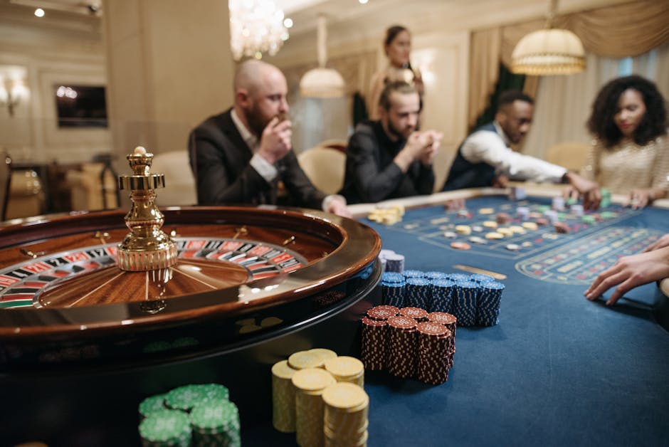
In a digital product, the same discipline applies to visual hierarchy. The important information should be easy to find, while ornamental elements should stay in their lane. A glittering background may suggest celebration, but if it competes with text or buttons, it is decoration stealing space from usability. In a room, the equivalent is an accessory or reflective surface that competes with the activity the space is meant to support.
None of these design choices changes the odds of winning. Visual presentation shapes mood, legibility, and the experience of a space or screen; it does not alter outcomes. Keeping that distinction clear makes for better design and more honest communication.
A final camera check
The accessories most likely to look weird under studio lighting are not necessarily the biggest or most expensive. They are the ones whose reflections, scale, or movement do not fit the frame. Mirror-like metal can become a blank flare. Loose sparkle can pull focus with every gesture. A glossy oversized piece can reflect the room instead of completing the look.
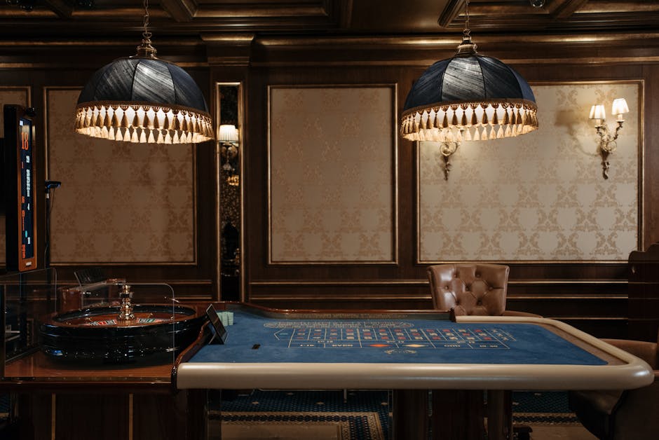
Good camera styling is less about removing personality than editing it. Pick a focal point, leave the image room to breathe, and check how the details behave on a phone screen. A little sheen can support the occasion; selective detail keeps it from becoming the whole story.